The Color of a Feeling
The Model Behind the Pour · Article 2 of 11
Flavor notes describe a liquid. Color describes an evening. Here is why we started asking for one instead of the other.
Ask a sommelier how they find strawberry in a glass and you expect chemistry. Sébastien Pradal — Best Young Sommelier of France in 1997, a Paris restaurateur who imports French wine into Mexico, and the consulting sommelier who coached the actors on Drops of God — answers differently:
"If it's strawberry it's a fuzzy memory of the aroma of strawberry that may remind you of your grandmother's strawberry jam. It's a combination of all the things you learn over the course of your life."
Not a compound. A grandmother.
That single sentence explains why tasting notes so often leave us cold. Leather, wet stone, white pepper — accurate, useful to a buyer, and silent on the only question that actually matters when you pour something at nine on a Tuesday: what is this going to feel like?
A tasting note describes the bottle. You are not the bottle.
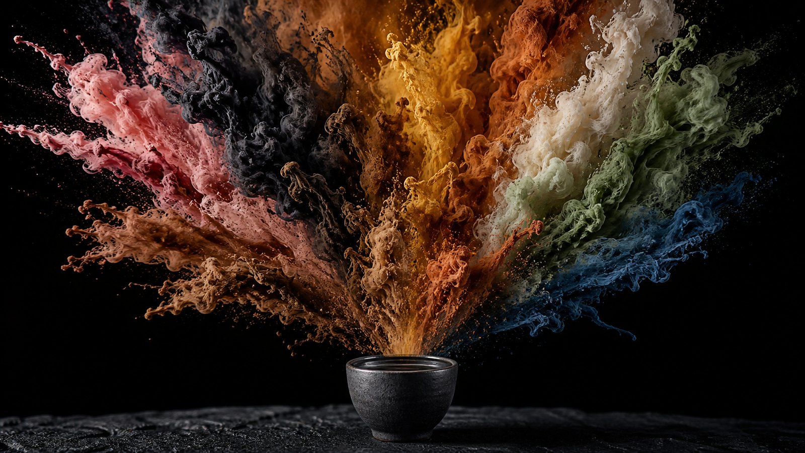
So we stopped asking people to name flavors and started asking them to name feelings. And because feelings are hard to say and easy to see, we let them answer in color.
What wine taught us, and the twist
Wine got here first, and it is worth being honest about that. No drink has a more developed sensory vocabulary, and none has thought harder about color. A wine's robe is read before anything is tasted — ruby, garnet, straw, amber — and that reading carries real information about age, grape and condition.
Drops of God is a wine story for the same reason. Camille's ability to taste in color works as drama because wine culture had already spent a century training people to look before they sip.
But here is where mezcal turns the lesson sideways.
Most mezcal is clear. There is no robe to read, no garnet rim, no straw-gold to interpret. The glass gives you almost nothing to look at. Which means that when we speak about color in agave spirits, we cannot be describing the liquid — there is no color in it to describe.
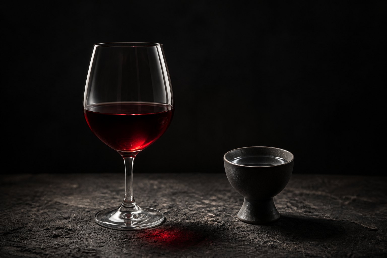
We can only be describing the experience.
Wine's color language is partly literal and partly emotional. Mezcal's can only ever be the second kind. Far from being a limitation, that is what makes it honest: a clear spirit forces the vocabulary to be about you.
And there is a second difference, which we offer as observation rather than result. A spirit arrives with more force than a wine does — more heat, more presence, more of itself at once. Whatever it attaches to in your memory, it seems to attach more firmly. The grandmother's jam is a soft recollection. A mezcal that reminds you of something tends to insist.
We have not measured that. We believe it, we have watched it happen across a lot of tables, and we say so as a belief.
The oldest shortcut
None of this is our invention. Pairing color with feeling may be the oldest shorthand people have.
It is often said that sommeliers approach tasting synesthetically — their senses cross wires. One sense fires, taste, and a second, entirely unrelated one answers: they see color. Involuntary, and the same every time.
That is the premise Drops of God is built on. Camille tastes a wine and sees an image, and the show treats it as a gift she has to learn to trust.
Here is the part that matters for the rest of us. Charles Spence and Carmel Levitan, reviewing decades of research in i-Perception in 2021, found "a surprisingly high degree of consistency" in how people map color onto taste — and it holds among non-synesthetes.
You do not need the condition. You already know a lemon feels yellow, and nobody has ever asked you to justify it. The sommelier isn't doing something exotic. They are doing what you do, with more practice and a better vocabulary.
Spence and Levitan also name a likely mechanism: emotional mediation. Color may attach to taste through feeling rather than directly — which is either an academic footnote or a design brief, depending on what you are trying to build.
The agreement runs wider than one language. In 2020, Domicele Jonauskaite and colleagues surveyed more than 4,500 people across 30 nations and 22 languages in Psychological Science, and found color-emotion associations that are broadly shared — and then further shaped by linguistic and geographic proximity. People whose languages sit closer together feel colors more alike.
That second half is the part we care about most. It says a color vocabulary is not arbitrary, and it is also not universal. It has a home.
Obsidian Black
Which brings us to black, and to the one color we think agave culture understands differently.
In most of the world, black leans toward grief. That reading is real and we are not arguing with it.
But sit with a mezcal in silence and notice what black is doing there. It is not sadness. It is attention. It is the pour that makes a room go quiet, the one you drink slowly because something in it asks you to. In our palette that color is Obsidian Black, and the feeling is Ritual.
Obsidian is not simply a dark stone in Mesoamerica. It is volcanic glass, worked into blades and mirrors, a material with ceremony attached long before anyone bottled anything.
And there is Día de Muertos, which does not deny that black holds loss — it sets a table for it. Marigolds, photographs, the dead person's favorite drink poured and left out. Grief is present and it is not the end of the sentence. The same color holds remembrance, reflection and celebration at once.
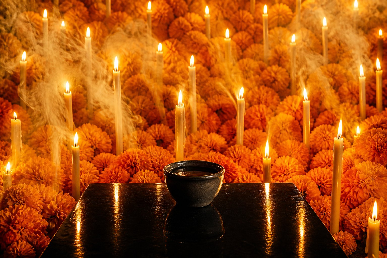
So we do not think agave culture contradicts the world's reading of black. We think it bridges it. Black can be sorrow and still be ceremony. The pour that deserves silence is not a sad pour. It is a serious one.
The words we chose
The color is only half of it. The word we attach matters just as much, and each of the eight was argued over.
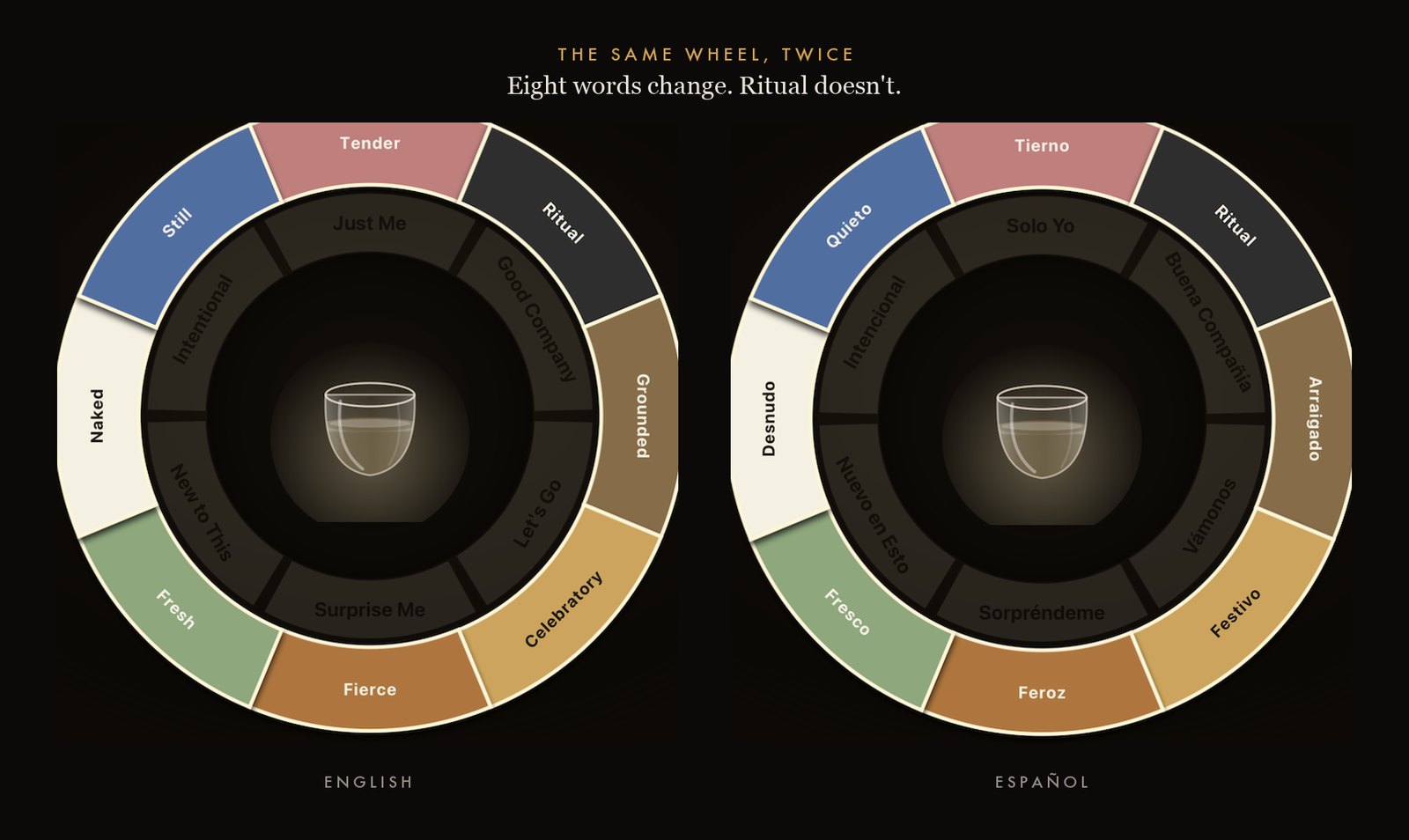
Desert Rose — Tender. Not romantic, which points at someone else. Tender includes tenderness toward yourself. The softer version of yourself. Alone and at ease.
Obsidian Black — Ritual. The one word identical in both languages, which felt right for the one feeling that needs no translation. For the pour that deserves silence.
Mineral Earth — Grounded. Rooted, really. It once carried a place name and we removed it, because not every earthy agave spirit comes from one state and a feeling should never quietly assert a region. Tastes like somewhere you've always belonged.
Amber Gold — Celebratory. Not happy. Happy is private; celebratory is shared, and generous. When the night is generous and so are you.
Copper Flame — Fierce. Not angry. Fierce is forward-facing, and it can be joyful. Without asking permission.
Sage Green — Fresh. The plant still in it. From earth to elixir.
Cream Ivory — Naked. The hardest word, and the most exact. Not clean, not simple — naked, meaning nothing concealed. Nothing hidden. Nothing added. Just agave.
Ocean Blue — Still. Not calm, which can be handed to you. Still is earned. The kind of calm that took years to earn.
One rule governs all eight, and it cost us a name to enforce. A color called Smoke is not a feeling — smoke is a production fact, something that happened to the agave in an oven. If someone reaches for a color, they should be describing their evening, never accidentally declaring what is in the bottle.
A color is a feeling, and must never smuggle in a fact.
The man who painted on air
There is one more person worth bringing into this, and he belongs to our industry.
Before Ron Cooper went to Oaxaca in 1970, before he founded Del Maguey and did more than almost anyone alive to carry single-village mezcal into the world, he was an artist. He belonged to Southern California's Light and Space movement, and for years his entire subject was how color is perceived.
His early Light Traps were poured slabs of resin and fiberglass that caught and bent light. He described them as "the closest thing to painting on air."
Later came the Separator Variations — colored fluorescent tubes divided by panes of glass, arranged so the colors reflect and overlap until they produce a third hue that exists in neither tube. The work demonstrates the additive nature of light, and something more useful than that: a viewer does not receive color the way they receive an object. Color arrives differently depending on where you are standing. Move, and it changes.
That is the entire argument of this article, made forty years earlier in resin and neon.
And then the man who spent a decade painting on air went to Oaxaca and devoted the rest of his life to a liquid that is, in the glass, almost perfectly clear.
We draw no theory from that. We just think it is the right note to end on. Del Maguey's bottles still carry Ken Price's vividly colored labels — the color on the outside, and inside, nothing to look at but everything to feel.
Pick the color you feel right now.
Find Your Pour →References
- Spence, C., & Levitan, C. A. (2021). Explaining crossmodal correspondences between colours and tastes. i-Perception, 12(3). doi.org/10.1177/20416695211018223
- Jonauskaite, D., et al. (2020). Universal patterns in color-emotion associations are further shaped by linguistic and geographic proximity. Psychological Science, 31(10), 1245–1260.
- Parker Wong, D. Interview with Sébastien Pradal, consulting sommelier for Drops of God (Apple TV+), on tasting, memory and synesthesia. deborahparkerwong.com
- Cooper, R. — Light Traps and Separator Variations; "the closest thing to painting on air," Cirrus Gallery, Ron Cooper: In a New Light.
A note on language. Proper nouns — spirits, agave varietals, brands, and the people who make them — keep their names in every language.